crypto.com · Nov 2020 — Jan 2023

Scaling crypto.com design system with design tokens

The crypto.com design system is a shared foundation across crypto.com app, Exchange, DeFi Wallet, NFT and Price Page. It was built to fix the things that slow a fast-moving org: accessibility gaps, theme drift, and UI bugs from cross-stack handoffs.

Role
Design system designer and advocate
Timeline
Nov 2020 — Jan 2023
Team
26 product designers, 3 brand designers, 12 engineers (representatives from Exchange, Price Page and Main App)

Result

50%
Reduction in designer time spent preparing Figma screens for theme variants.
300+
Components mapped with design tokens, covering 95%+ of existing component use cases.
−40%
Average reduction in UI bug tickets on Jira, with less back-and-forth between frontend and design.

Problem

3 problems kept surfacing across products

crypto.com was shipping fast across many products and stacks. Before design tokens, the same friction showed up sprint after sprint:

A11Y accessibility

Some colour pairs failed WCAG contrast in real component states, creating accessibility risk.

Dark and light mode support

Exchange products and Price Page needed reliable theme switching without duplicated design work.

Different tech stacks across products

Different stacks made UI alignment hard; every gap became a Jira bug ticket.

Design approach

  1. Prioritise foundational design elements like type and colour first, so the system can scale across products.
  2. Create an active feedback loop between designers and engineers. Other designers and engineers do not just consume the system. We share updates, raise requests, prioritise work and ship maintenance together. The loop keeps the libraries current and trusted.

Fig. 01: A continuous feedback loop between designers and engineers.

1. Consolidate design foundation

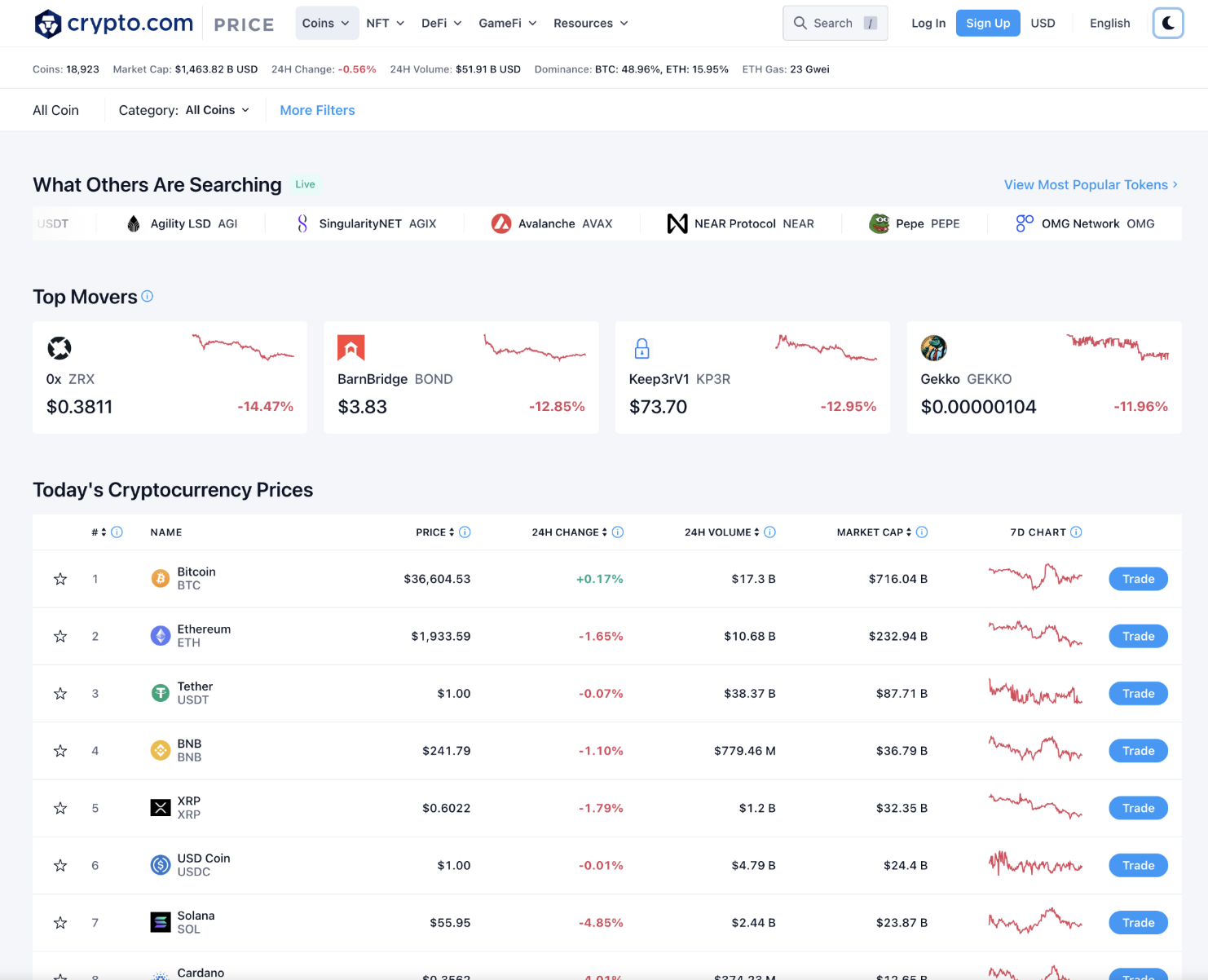
The first audit was the colour palette. The old version was product-specific: each platform kept its own ramp, and several tones failed WCAG contrast when checked against real text and component states. I tested every pair using the Able Figma plugin, mapping each one to a target accessibility level (A → AA → AAA).

Old colour palette: green, red, yellow, blue and grey ramps with WCAG contrast scores; the Able Figma plugin showing green-50 (#20BCA4) failing contrast against white

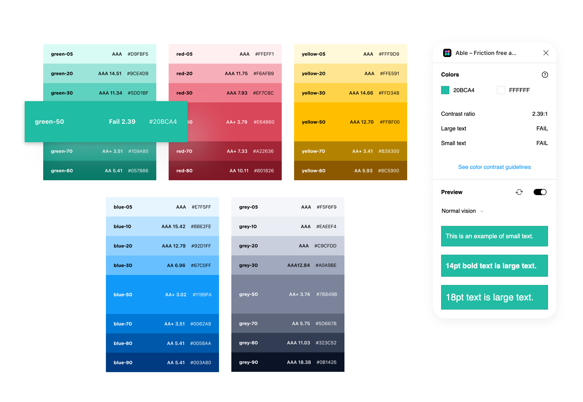
Fig. 02: old palette audited with the Able Figma plugin. For example, Green-50 (#20BCA4) failed WCAG contrast against white.

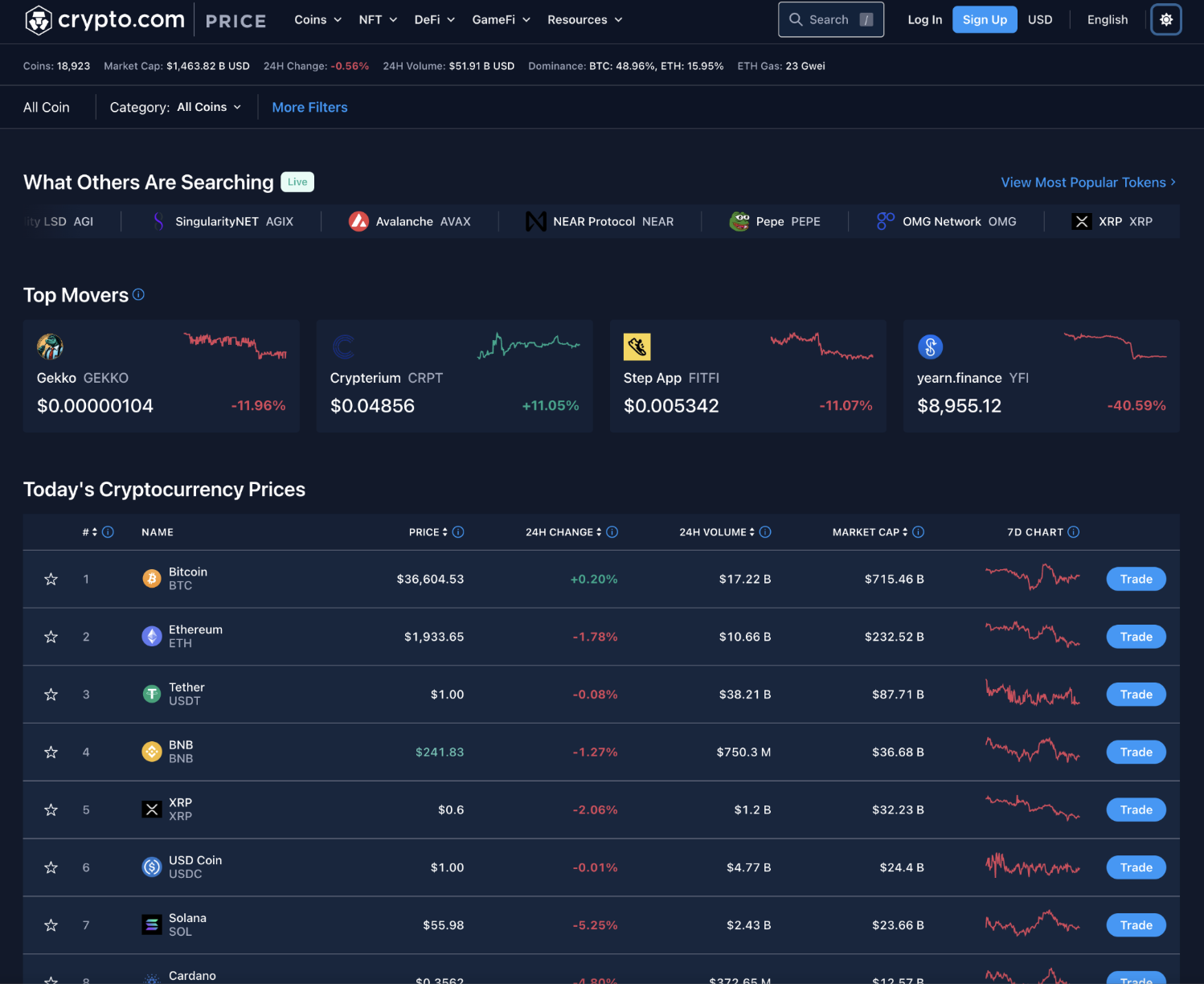
Then I rebuilt the palette as a global colour library shared across all crypto.com products. Darker shades were added to support dark mode, and alternative hues were introduced so product teams had room to differentiate without forking the foundation.

Brand blue
50
100
200
300
400
500
600
700
800
900
Functional green
50
100
200
300
400
500
600
700
800
900
Functional red
50
100
200
300
400
500
600
700
800
900
Functional yellow
50
100
200
300
400
500
600
700
800
900
Decorative purple
50
100
200
300
400
500
600
700
800
900
Decorative orange
50
100
200
300
400
500
600
700
800
900
Content
50
100
200
300
400
500
600
700
800
900
Black and white
Black
White

Fig. 03: global colour library with seven ramps × ten shades plus Black and White, audited for WCAG contrast and shared across all products.

2. Test and introduce design tokens

With a clean palette in hand, the next step was to give those colours names that meant something. Design tokens are introduced at this point as a source of truth to name and store repeatable design decisions. They became the common language for makers across different design tools and tech stacks.

Token names follow a three-part structure: colour usage · role · state. So a button background might be --background-button-primary rather than Blue 50. The same token resolves to a different palette value for light, dark, or a special rainbow theme, so theming becomes one swap instead of a hundred edits.

1.colour usage
background content border gradient etc...
- 2.role (optional)
button input layer chart etc...
- 3.state / variation
primary secondary default hover etc...

Fig. 04: token names follow a three-part structure: colour usage, role (optional), and state or variation. Hover each pill to reveal possible values.

Input text
Title

Lorem ipsum dolor sit amet, consectetur adipiscing elit.

Fig. 05: same colour, different intent. Toggle between Before (raw palette name) and After (semantic token) to see how naming changes across components.

Semantic token
--background-button-primary
Base token
Blue 50
Light mode
Base token
Blue 60
Dark mode
Base token
Rainbow
🌈 mode

Fig. 06: one token, three themes. The --background-button-primary token resolves to a different palette value depending on theme.

The table below is a sample from the full token reference, showing how each token maps to palette values, themes and usage notes.

1. Background

Background / Surface
TokenPaletteHexUsage
--background-surface-1White#FFFFFFPrimary surfaces (e.g. Main app sections)
--background-surface-1-hoverGrey-50#F7F9FAHover color for -surface-1
--background-surface-2Grey-50#F7F9FASecondary surfaces (e.g. Side Nav)
--background-surface-2-hoverBlue-400-a20#1199FA33Hover color for -surface-2
--background-surface-emphasisWhite#FFFFFFHighlighted layouts e.g. tooltips, messages
--background-surface-contrastBlue-700#002F61
--background-surface-contrast-hoverBlue-600#034481Hover state for --surface-contrast
Background / Status
TokenPaletteHexUsage
--background-status-danger-boldRed-500#E0485CHighlighted background for failure, invalid state etc
--background-status-dangerRed-200#FAACB6Default background for failure, invalid state
--background-status-danger-subtleRed-100#FFE9ECSubtle background for failure, invalid state
--background-status-pending-boldYellow-500#F5B700Highlighted background for pending, warning or caution
--background-status-pendingYellow-200#FFE591Default background for pending, warning or caution
--background-status-pending-subtleYellow-100#FFF9D9Subtle background for pending, warning or caution
--background-status-success-boldGreen-500#00A68CHighlighted background for Success, On
--background-status-successGreen-200#ACECE1Default background for Success, On
--background-status-success-subtleGreen-100#E6FAF6Subtle background for success / "On" scenarios
--background-status-active-boldBlue-400#1199FAHighlighted background for Information
--background-status-activeBlue-200#92D1FFDefault background for informational messages
--background-status-active-subtleBlue-50#E7F5FFSubtle background for informational messages
--background-status-neutral-boldGrey-400#7B849BHighlighted background for disabled, cancel or ended
--background-status-neutralGrey-200#C9CFDDDefault background for disabled, cancel or ended scenarios
--background-status-neutral-subtleGrey-50#F7F9FASubtle background for disabled, cancel or ended scenarios
Background / Decorative
TokenPaletteHexUsage
--background-decorative-purple-boldPurple-500#9255C2
--background-decorative-purplePurple-200#D9C0FA
--background-decorative-purple-subtlePurple-100#F2EBFB
--background-decorative-orange-boldOrange-500#F76341
Background / Button
TokenPaletteHexUsage
--background-button-primaryBlue-400#1199FAPrimary button color
--background-button-primary-hoverBlue-300#4DB5FFHover color for --button-primary
--background-button-text-hoverBlue-400-a5#1199FA0DHover color for text button
--background-button-dangerRed-500#E0485CDestructive action / sell
--background-button-danger-hoverRed-400#E35F70Hover color for -button-red
--background-button-text-danger-hoverRed-500-a5#E34F630DHover color for -button-text-danger
--background-button-successGreen-500#00A68CBuy
--background-button-success-hoverGreen-400#2BC2ABHover color for --button-green
--background-button-text-success-hoverGreen-500-a5#00A68C0DHover color for -button-text-success
--background-button-oncolorWhite-800#FFFFFFCCButtons on background with status colors
--background-button-oncolor-hoverWhite-700#FFFFFFB2Hover color for --button-oncolor
Background / Overlay
TokenPaletteHexUsage
--background-overlay-modalBlack-500#00000080Overlay background for modals

2. Border

Border / Surface
TokenPaletteHexUsage
--border-surfaceBlack-100#0000001ABorder on all surfaces
--border-surface-emphasisBlack-200#00000026Border with emphasis, e.g. fields
--border-surface-contrastBlack-100#0000001ABorder on -surface-contrast
Border / Status
TokenPaletteHexUsage
--border-status-activeBlue-400#1199FAActive border (e.g. Tab, focused field)
--border-status-dangerRed-500#E0485CInvalid state border (e.g. Error field)
Border / Button
TokenPaletteHexUsage
--border-button-primaryBlue-400#1199FAOutline buttons (i.e. secondary button)
--border-button-dangerRed-500#E0485COutlined button with danger status
--border-button-successGreen-500#00A68COutlined button with success status
--border-button-secondaryGrey-400#7B849BCheckboxes

3. Content

For icons, texts, and charts

TokenPaletteHexUsage
--content-primaryGrey-900#0B1426Headers and primary text
--content-secondaryGrey-500#565F76Secondary text (e.g. captions, supplementary info, subhead)
--content-tertiaryGrey-300#A0A9BETertiary text (e.g. placeholder text)
--content-dangerRed-500#E0485CError text
--content-danger-boldRed-800#801826
--content-success-subtleGreen-700#017361Success text
--content-successGreen-700#017361Success text
--content-success-boldGreen-800#005747
--content-activeBlue-400#1199FAInteractive text
--content-active-boldBlue-700#002F61
--content-pendingYellow-700#B38300Text with pending status
--content-pending-boldYellow-800#8C5900
--content-contrast-primaryWhite#FFFFFFPrimary text on -surface-contrast
--content-contrast-secondaryGrey-300#A0A9BESecondary text on -surface-contrast
--content-forced-tertiaryGrey-400#7B849BTertiary content with a forced-grey
Content / Decorative
TokenPaletteHexUsage
--content-decorative-redRed-300#ED7685Graphs and other decorative use of colors
--content-decorative-yellowYellow-500#F5B700Graphs and other decorative use of colors
--content-decorative-greenGreen-600#109A85Graphs and other decorative use of colors
--content-decorative-blueBlue-400#1199FAGraphs and other decorative use of colors
--content-decorative-purplePurple-600#8E3DDBGraphs and other decorative use of colors
--content-decorative-purple-boldPurple-800#60308CText which needs decorative styling
--content-decorative-greyGrey-200#C9CFDDGraphs and other decorative use of colors

4. Common

For generic use, same color in both light and dark mode

TokenPaletteHexUsage
--common-whiteWhite#FFFFFF
--common-secondaryGrey-500#565F76
--common-tertiaryGrey-400#7B849B
--common-darkGrey-900#0B1426
--common-primaryBlue-400#1199FA
Common / Gradient
TokenPaletteHexUsage
--common-gradient-line-chartBlue-400 → 0%#1199FA 20% → 0%Gradient background for line charts
--common-gradient-margin#E0485C → #FFBF00Gradient background for margin trading enabled
--common-gradient-health-rainbow#005747 → #E0485CAccount health status
--common-gradient-promo-1#26D1D3 → #9F86C1Promotions on new features
--common-gradient-stake-card#FFF73E → #6FDCFF

1. Background

Background / Surface
TokenPaletteHexUsage
--background-surface-1Grey-800#151D32Primary surfaces (e.g. Main app sections)
--background-surface-1-hoverGrey-700#1F283CHover color for -surface-1
--background-surface-2Grey-700#1F283CSecondary surfaces (e.g. Side Nav)
--background-surface-2-hoverBlue-400-a20#1199FA33Hover color for -surface-2
--background-surface-emphasisGrey-600#323C52Highlighted layouts e.g. tooltips, messages
--background-surface-contrastWhite#FFFFFFTooltip
--background-surface-contrast-hoverGrey-100#EAEEF4Hover state for --surface-contrast
Background / Status
TokenPaletteHexUsage
--background-status-danger-boldRed-500#E0485CHighlighted background for failure, invalid state etc
--background-status-dangerRed-800#801826Default background for failure, invalid state
--background-status-danger-subtleRed-900#4D0E17Subtle background for failure, invalid state
--background-status-pending-boldYellow-500#F5B700Highlighted background for pending, warning or caution
--background-status-pendingYellow-800#8C5900Default background for pending, warning or caution
--background-status-pending-subtleYellow-900#593900Subtle background for pending, warning or caution
--background-status-success-boldGreen-500#00A68CHighlighted background for Success, On
--background-status-successGreen-800#005747Default background for Success, On
--background-status-success-subtleGreen-900#00392FSubtle background for success / "On" scenarios
--background-status-active-boldBlue-400#1199FAHighlighted background for Information
--background-status-activeBlue-600#034481Default background for informational messages
--background-status-active-subtleBlue-800#00254FSubtle background for informational messages
--background-status-neutral-boldGrey-400#7B849BHighlighted background for disabled, cancel or ended
--background-status-neutralGrey-600#323C52Default background for disabled, cancel or ended scenarios
--background-status-neutral-subtleGrey-700#1F283CSubtle background for disabled, cancel or ended scenarios
Background / Decorative
TokenPaletteHexUsage
--background-decorative-purple-boldPurple-500#A855F7
--background-decorative-purplePurple-800#60308C
--background-decorative-purple-subtlePurple-900#441860
--background-decorative-orange-boldOrange-500#F76341
Background / Button
TokenPaletteHexUsage
--background-button-primaryBlue-400#1199FAPrimary button color
--background-button-primary-hoverBlue-300#4DB5FFHover color for --button-primary
--background-button-text-hoverBlue-400-a10#1199FA1AHover color for text button
--background-button-dangerRed-500#E0485CDestructive action / sell
--background-button-danger-hoverRed-400#E35F70Hover color for -button-red
--background-button-text-danger-hoverRed-500-a10#E34F631AHover color for -button-text-danger
--background-button-successGreen-500#00A68CBuy
--background-button-success-hoverGreen-400#2BC2ABHover color for --button-green
--background-button-text-success-hoverGreen-500-a10#00A68C0DHover color for -button-text-success
--background-button-oncolorBlack-300#0000004DButtons on background with status colors
--background-button-oncolor-hoverBlack-200#00000033Hover color for --button-oncolor
Background / Overlay
TokenPaletteHexUsage
--background-overlay-modalBlack-500#00000080Overlay background for modals

2. Border

Border / Surface
TokenPaletteHexUsage
--border-surfaceWhite-100#FFFFFF1ABorder on all surfaces
--border-surface-emphasisWhite-200#FFFFFF33Border with emphasis, e.g. fields
--border-surface-contrastBlack-100#0000001ABorder on -surface-contrast
Border / Status
TokenPaletteHexUsage
--border-status-activeBlue-400#1199FAActive border (e.g. Tab, focused field)
--border-status-dangerRed-500#E0485CInvalid state border (e.g. Error field)
Border / Button
TokenPaletteHexUsage
--border-button-primaryBlue-400#1199FAOutline buttons (i.e. secondary button)
--border-button-dangerRed-500#E0485COutlined button with danger status
--border-button-successGreen-500#00A68COutlined button with success status
--border-button-secondaryGrey-400#7B849BCheckboxes

3. Content

For icons, texts, and charts

TokenPaletteHexUsage
--content-primaryWhite#FFFFFFHeaders and primary text
--content-secondaryGrey-300#A0A9BESecondary text (e.g. captions, supplementary info, subhead)
--content-tertiaryGrey-400#7B849BTertiary text (e.g. placeholder text)
--content-dangerRed-500#E0485CError text
--content-danger-boldRed-200#FAACB6
--content-success-subtleGreen-700#017361Success text
--content-successGreen-500#00A68CSuccess text
--content-success-boldGreen-200#ACECE1
--content-activeBlue-400#1199FAInteractive text
--content-active-boldBlue-200#92D1FF
--content-pendingYellow-500#F5B700Text with pending status
--content-pending-boldYellow-200#FFE591
--content-contrast-primaryGrey-900#0B1426Primary text on -surface-contrast
--content-contrast-secondaryGrey-500#565F76Secondary text on -surface-contrast
--content-forced-tertiaryGrey-400#7B849BTertiary content with a forced-grey
Content / Decorative
TokenPaletteHexUsage
--content-decorative-redRed-300#ED7685Graphs and other decorative use of colors
--content-decorative-yellowYellow-500#F5B700Graphs and other decorative use of colors
--content-decorative-greenGreen-600#109A85Graphs and other decorative use of colors
--content-decorative-blueBlue-400#1199FAGraphs and other decorative use of colors
--content-decorative-purplePurple-600#8E3DDBGraphs and other decorative use of colors
--content-decorative-purple-boldPurple-300#CD9EFFText which needs decorative styling
--content-decorative-greyGrey-200#C9CFDDGraphs and other decorative use of colors

4. Common

For generic use, same color in both light and dark mode

TokenPaletteHexUsage
--common-whiteWhite#FFFFFF
--common-secondaryGrey-500#565F76
--common-tertiaryGrey-400#7B849B
--common-darkGrey-900#0B1426
--common-primaryBlue-400#1199FA
Common / Gradient
TokenPaletteHexUsage
--common-gradient-line-chartBlue-400 → 0%#1199FA 20% → 0%Gradient background for line charts
--common-gradient-margin#E0485C → #FFBF00Gradient background for margin trading enabled
--common-gradient-health-rainbow#005747 → #E0485CAccount health status
--common-gradient-promo-1#26D1D3 → #9F86C1Promotions on new features
--common-gradient-stake-card#FFF73E → #6FDCFF

3. Roll out the system for testing

Rollout was deliberately staged. We started with the token Price page, which had a smaller scope, lighter design and tech debt, and a low-risk place to prove the approach. From there, we moved to Exchange web: the first mature platform, ~15 sub-features and up to 100 components touched.

Each rollout produced a sticker sheet of UI components in both light and dark mode. It gave designers and engineers a visible artefact to align on. By the end of the staged rollout, design tokens were applied to roughly 100 existing components on Exchange alone.

Adopt design tokens · staged rollout

Token price pageFirst product · smaller scope, smaller design and tech debt
Exchange web1st mature platform · ~15 sub-features, up to 100 components
crypto.com appPhased release · biggest surface area
DeFi Wallet · NFT
All products

Fig. 07: staged rollout. Each step lowered the risk of the next and produced a sticker sheet for the team to align on.

crypto.com / price · token system in production
crypto.com Price page: light mode rendering using design tokens. Top movers, today's cryptocurrency prices table. crypto.com Price page: dark mode rendering using the same design tokens. Identical layout, swapped semantic theme values.

Fig. 08: the token Price page in production. Click Light / Dark to see the same components re-theme through the semantic token layer, the core deliverable of the rollout.

crypto.com Exchange UI components sticker sheet showing roughly 100 components — calendars, input fields, dropdowns, status pills, sliders, OTP fields, gradient bars and side panels — rendered in both light (top half) and dark (bottom half) themes from the same design tokens.

Fig. 09: Exchange UI components sticker sheet. ~100 components migrated to the design tokens, paired between design and engineering and shipped in both themes from a single source.

4. Results

By the time the rollout reached steady state, the system was carrying real weight across the org. The Swapper Figma plugin let designers re-theme an entire screen with one click, cutting variant preparation time in half. On the engineering side, UI alignment bugs and back-and-forth dropped sharply.

Reflection

A design system isn't an assembly of guidelines. It's a shift in how a team works together. The biggest lesson from these two years was to go for the "good enough" option rather than over-engineer. A token rollout that ships and gets adopted beats a perfect token spec that nobody uses. Foundations first, feedback loop second, and the rest follows.

Up next

AIR design system file being grabbed by a cursor — agentic workflow preview

Scaling AIR's product design with an agentic workflow

View project