Ant Bank @ Ant Financial · Sep 2019 — Dec 2020

Libra Savings for Hong Kong users

Ant Bank's first financial product. Libra Savings (存款寶) is a high yield savings account with up to 2.5% annual interest rate. The MVP version has been launched in September 2020, partnering with AlipayHK (e-wallet by Ant Group) to integrate banking services into consumer daily needs. Users can open a savings account with the Ant Bank app, or with the mini app in AlipayHK wallet.

Role
Product designer
Timeline
Sep 2019 — Dec 2020
Team
Hangzhou design team, HK copywriters, legal & compliance, engineering on both sides

Background

Ant Bank's first financial product, designed for Hong Kong

I was the product designer at Ant Bank (HK) in 2019-2020. Every screen and content that a user might see on Libra Savings was my responsibility. Not only I needed to align design action items with the design team, but also collaboration across our tech team, external copywriters as well as each Hong Kong staff leads to a huge success of our first financial product.

Libra Savings hero: two tilted iPhone mockups showing the Hong Kong home screen with orange gradient, and the HKD 1,000 transfer-in screen.

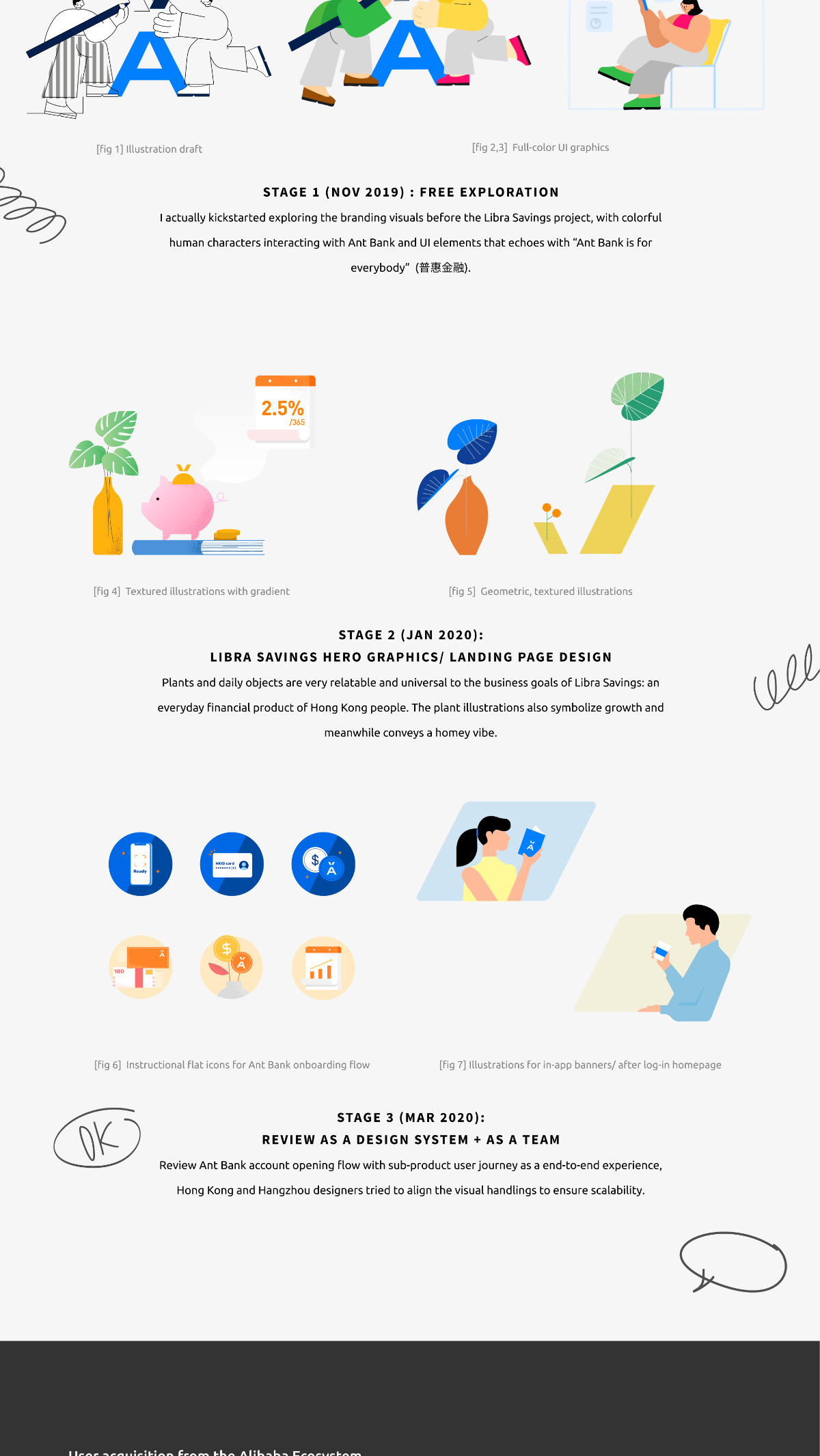
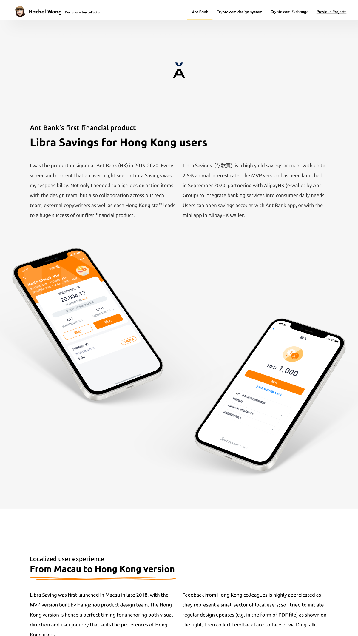
1. Localized user experience: from Macau to Hong Kong version Context

Libra Saving was first launched in Macau in late 2018, with the MVP version built by Hangzhou product design team. The Hong Kong version is hence a perfect timing for anchoring both visual direction and user journey that suits the preferences of Hong Kong users.

Feedback from Hong Kong colleagues is highly appreciated as they represent a small sector of local users; so I tried to initiate regular design updates (e.g. in the form of PDF file) as shown on the right, then collect feedback face-to-face or via DingTalk.

A4 PDF design preview spread shared with the Hong Kong team for feedback; below it, a colourful sticky-note wall capturing comments from Alex, Fiona, Nancy, Rosie, Kiba, Baofang, Simon and Lily on the early branding direction.

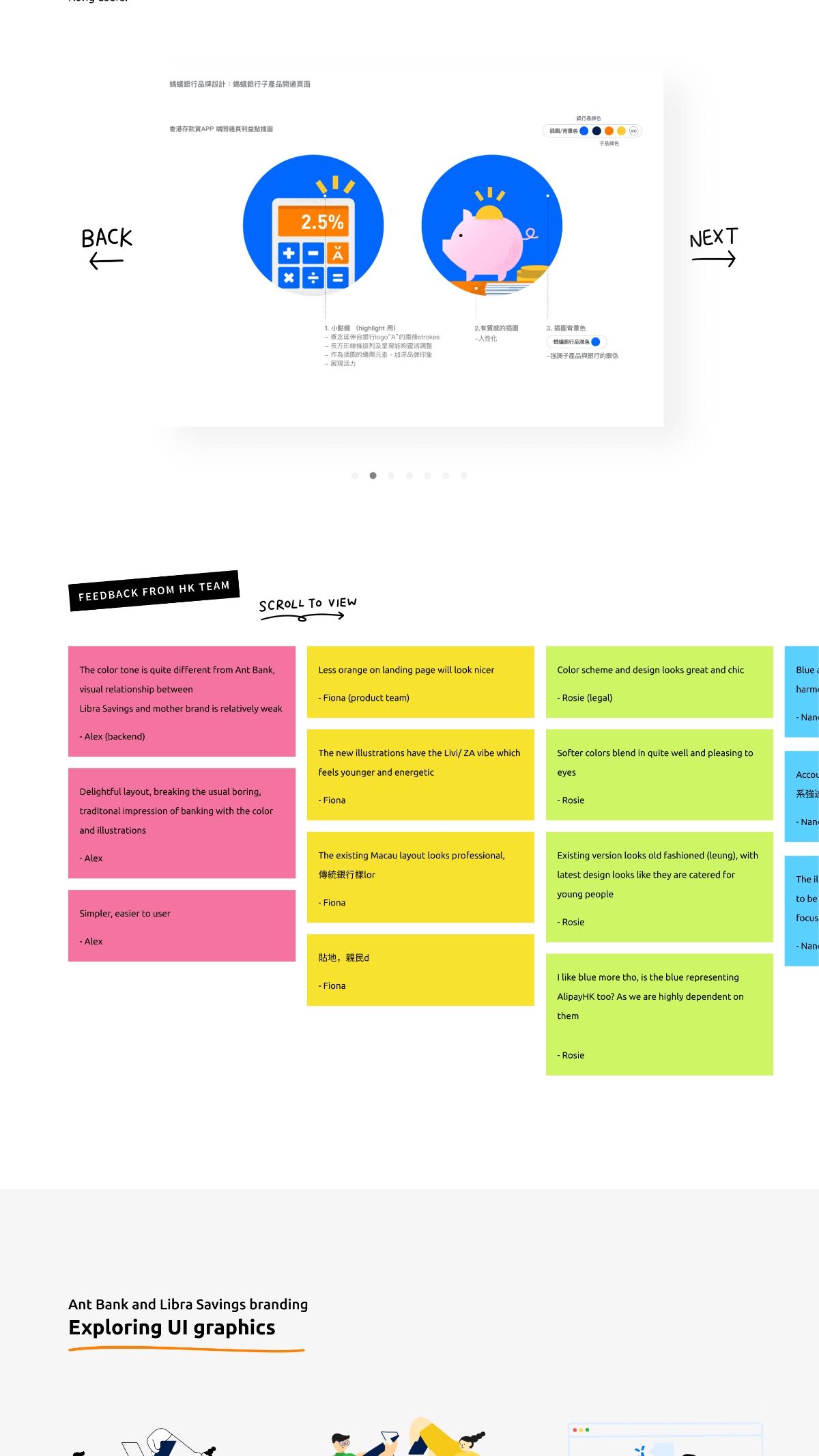
Fig. 01: PDF design preview circulated to HK colleagues, plus the sticky-note feedback wall used to gather face-to-face and DingTalk feedback.

2. Ant Bank and Libra Savings branding Process · Exploring UI graphics

Stage 1 · Nov 2019

Free exploration

I actually kickstarted exploring the branding visuals before the Libra Savings project, with colorful human characters interacting with Ant Bank and UI elements that echoes with "Ant Bank is for everybody" (普惠金融).

Stage 2 · Jan 2020

Libra Savings hero graphics & landing page design

Plants and daily objects are very relatable and universal to the business goals of Libra Savings: an everyday financial product of Hong Kong people. The plant illustrations also symbolize growth and meanwhile conveys a homey vibe.

Stage 3 · Mar 2020

Review as a design system + as a team

Review Ant Bank account opening flow with sub-product user journey as an end-to-end experience, Hong Kong and Hangzhou designers tried to align the visual handlings to ensure scalability.

Three stages of illustration evolution: Stage 1 free exploration with cheerful human characters; Stage 2 hero graphics and landing-page illustrations using plants, piggy banks and everyday objects; Stage 3 design-system icons and mobile in-app flow illustrations.

Fig. 02: three stages of branding exploration, ending in a plant-and-daily-objects system reviewed jointly with the Hangzhou team.

3. User acquisition from the Alibaba ecosystem What's special about Ant Bank products · Account opening flows and user journey

Besides creating a Libra Saving account with Ant Bank native app, AlipayHK users can open an Ant Bank account with the mini-app in their e-wallet. Ant Bank receives users' personal information from AlipayHK for quick identification and account opening.

We had identified 3 use cases and the steps are illustrated with the user flow diagram below.

Two user flow diagrams: Entry point 1 from AlipayHK mini-app (orange path) showing brand-new user, existing AlipayHK user with extra steps, and shared landing; Entry point 2 from Ant Bank app (blue path) with the equivalent registration flow.

Fig. 03: user flow diagrams for both entry points, mapping three use cases through a shared registration journey.

4. Context is key Design challenge · Effective, friendly communication with local users

I was surprised to know the team didn't manage the Chinese existing copy with CMS (Content Management System) before, and the auto-translated English copy was simply terrible. Hong Kong designers then collaborated with external UX copywriter to review every single word for a better and localized user experience.

To communicate with developers about the foreseeable frontend updates, I also worked on the English versions for all the screens with specifications and side notes. Some of the handlings for Chinese environment needed to be adjusted or aligned to save dev cost.

Chinese and English layout specifications side by side for the same screen, plus the bilingual type scale demo aligning Display H1, H2, H3, CTA text, body text and captions across PingFang HK and SF Pro Text.

Fig. 04: bilingual layout specs and the type scale demo aligning hierarchy across Chinese and English.

Excel review table tracking Chinese error messages, English translations, triggering scenarios, and review notes from designers, copywriters, and legal teams.

Fig. 05: Excel review table used for back-and-forth alignment with copywriters, legal and compliance.

Designing for Hong Kong users meant rebuilding the conversation, every word, every screen, in two languages.

Libra Savings · Ant Bank · 2019 — 2020

Next

An agentic workflow at AIR

Scaling AIR's product design with an agentic workflow, turning the design repo into a practical space for testing and shipping with AI in the loop.

Read AIR